
Brussels Airlines New Logo Rebranding Fail
Brussels Airlines has come under attack after a big Polish online news portal complained that the new logo of the airline is a copy of their emblem.
Brand identity
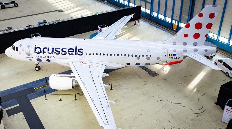
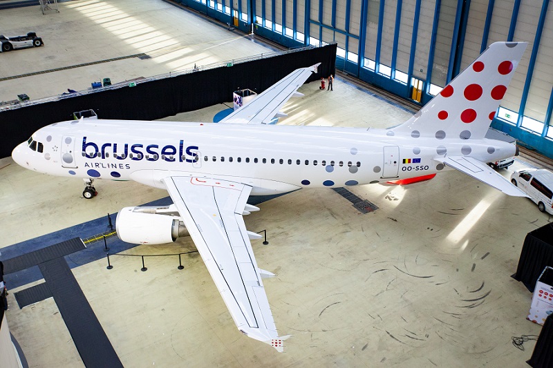
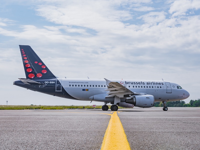
Today, Brussels Airlines launched its new brand identity which saw a complete overhaul of the company’s logo as well as the livery used on their planes.
According to the Belgian flag carrier, the new identity involves “updated colours, a new logo and aircraft livery” which are “the visual token of the airline’s new chapter, stating its readiness for future challenges and re-emphasizing on the importance of the Belgian brand”.
Brussels Airlines Head of Marketing Michel Moriaux said: “This new brand identity is a very logical step for Brussels Airlines. After years marked by so many changes, it is important to clarify and confirm our position in the market.
“We are changing into a new company, with new cabin interiors, digitized processes, fleet renewal with A320neo’s on the way, and much more to come. Together with Today Agency, we created a more contemporary branding, one that is fit for our digital age, one that represents a reliable and modern airline.”
Logo
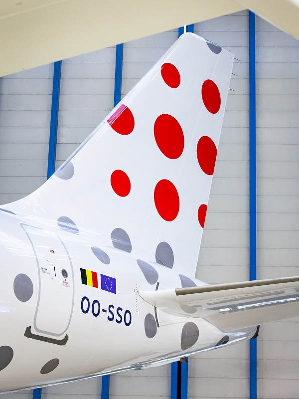
Most striking is the new logo of Brussels Airlines. Previously, the company’s logo was a dotted letter ‘b’ which of course referred to the first letter of the Belgian capital of Brussels where the airline has its main base.
This logo has been redesigned into a new dotted logo which exists out of 9 dots of different sizes in the form of a square.
According to Brussels Airlines, this represents “the diversity of its customers, its destinations and its employees”.
Social media
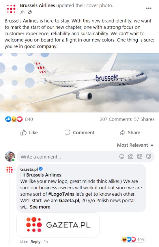
The new logo of Brussels Airlines did not go unnoticed on social media. Polish online news portal Gazeta, which ranks among the top 10 most visited websites in Poland, complained to Brussels Airlines that their new logo was almost a copy of theirs.
On Facebook, Gazeta wrote to the Belgium airline: “Hi Brussels Airlines! We like your new logo, great minds think alike! We are sure our business owners will work it out but since we are some sort of #LogoTwins let’s get to know each other. We’ll start: we are Gazeta.pl, 20 y/o Polish news portal with millions of readers. We see you are into planes or something?”
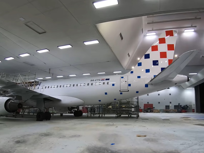
Croatia Airlines
Netizens were also quick to react that the new logo of Brussels Airlines strongly resembled that of Croatia Airlines, which just like the Belgian flag carrier is part of the Star Alliance network.
Although Croatia Airlines uses red squares instead of red dots, there certainly is a resemblance here as well.
My take
Personally, I’m not sure what to think about the new Brussels Airlines livery. It does look sleek and more modern, that’s for sure, but at the same time I also find it rather bland and boring.
The fact that the logos from two other large companies are almost identical tells quite a lot about the redesign of the Brussels Airlines logo and livery. Although it follows modern-day design trends, it automatically means that it doesn’t stand out.
What do you think of the new logo and livery of Brussels Airlines?
Never miss out on news and flight deals
If you want to stay up to date on the latest travel news, make sure to regularly check the Paliparan website. We also recommend you to regularly check the flight deals section on Paliparan.com to ensure that you will not miss out on great travel deals or special sales.
Or subscribe to our Twitter, Facebook and Instagram and pages to receive instant Paliparan updates!
Oh, dear. It’s all a bit of a mess, too like Croatia, mimicing Gazeta and the plane looks like it has chicken pox.
I hope they didn’t pay for this because it’s hardly a design, more some paint thrown at a blank canvas. Perhaps it was a primary school project?